

Ontario College Certificate
Academic & Career Entrance (ACE)
The Academic & Career Entrance (ACE) program provides an Ontario grade 12 equivalency diploma to access college programs, universities, and apprenticeships.
This page is a practical style guide for your Internal Website page sections. It shows a small set of recommended working examples, explains what each content type is for, and helps editors choose the right block.
The goal is not to show every possible variation. The goal is to show the patterns your team should actually use, explain why they work, and document the core fields that influence layout, accessibility, and content quality.
For a reference of all shared fields used across components, see the core fields guide below.
Every example below is shown in a pattern that could be recreated using the actual component system you described.
The purpose of this guide is decision support, not a complete matrix of every option.
Each component section includes a short working example plus guidance on when to use it and when to avoid it.
Header is especially useful before components like Media + Rich Text that do not include a built-in heading field.
Header gives a section its title before the next component starts. Use it when the component below does not already have a strong built-in heading.
Start with Header. Add Eyebrow only if it adds useful context. Add Introduction only if the next section needs a short setup sentence.
Choose the heading level carefully. H2 is the normal choice for most page sections. Use background color and top/bottom spacing to help this heading connect properly to the sections around it.
If you are using Media + Rich Text next, this Header often becomes the section title people see first. Write it like a clear page signpost, not like a slogan.
This is the cleanest option for simple WYSIWYG content. Do not turn it into a fake layout tool.
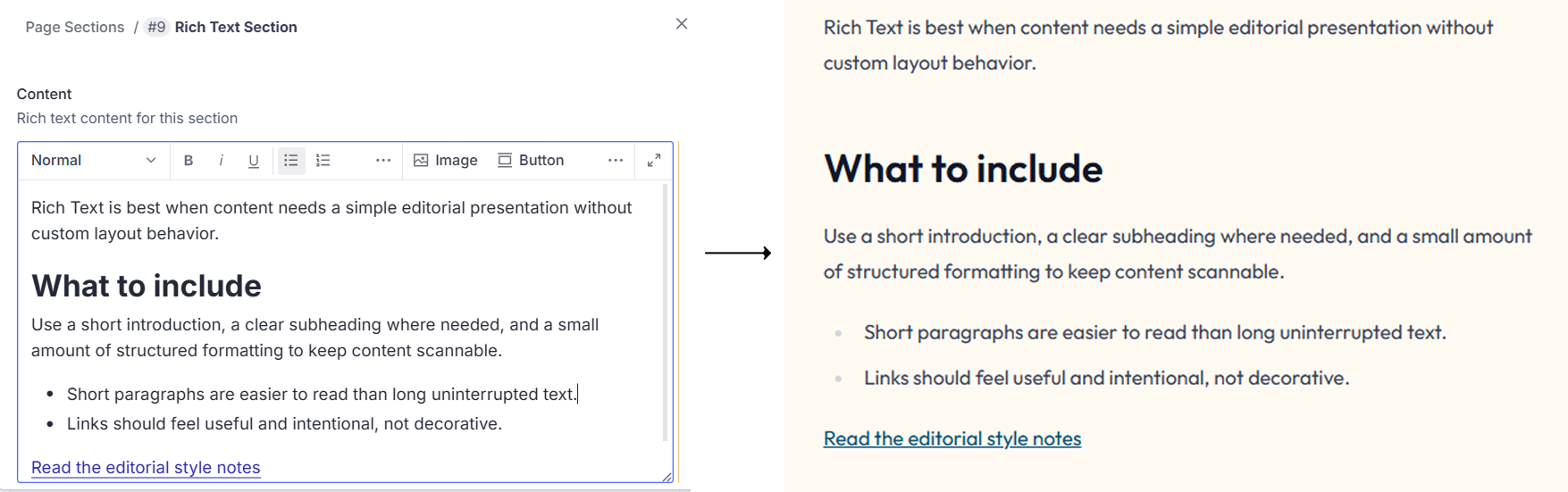
Rich Text is the simplest content block. It is for normal page copy where the content matters more than the layout.
You only need the Content field, then background color and spacing in Advanced Options. Build the message directly inside the editor using paragraphs, lists, links, and small subheadings only when needed.
This section does not create a special layout by itself. The layout comes from clean spacing, readable line length, and simple formatting inside the editor.
If you find yourself trying to add repeated items, side-by-side content, or heavy visual structure, stop and use another component instead.
This component has no heading field, so the rich text itself should begin strongly. Show only the meaningful layout variations.


This alternate alignment is useful when a page contains several media sections and you want to keep visual rhythm without changing the component itself. Use short paragraphs, bullets when helpful, and one or two buttons only when a clear next step exists.
This section places rich text beside an image. It is useful when content needs explanation and a supporting visual at the same time.
Start with the Rich Text field because there is no separate heading field. Then add the image, alt text, button if needed, background color, and image alignment.
Your main choice is whether the image appears left or right. Use left/right changes only to improve flow on long pages. The image height will follow the content height, so keep the text concise enough to stay balanced.
Write the first line of the rich text as if it were the section opener. Since there is no heading field, that first sentence carries a lot of weight.
This component supports many layouts, but your guide should standardize only a small number of patterns.

Confederation College commits to realizing the Negahneewin Vision through reconciliation and renewed relationships with Indigenous peoples as partners for change in education. This is achieved by building common ground between Indigenous and non-Indigenous peoples through a mutual understanding of history, a shared vocabulary and rich dialogue.
Confederation College commits to realizing the Negahneewin Vision through reconciliation and renewed relationships with Indigenous peoples as partners for change in education. This is achieved by building common ground between Indigenous and non-Indigenous peoples through a mutual understanding of history, a shared vocabulary and rich dialogue.

Feature is a high-emphasis section for one important message. It is stronger and more visual than Media + Rich Text.
Fill Title first, then Eyebrow if needed, then Text, then one or two buttons. Add image or icon only if it strengthens the message.
Choose the layout first: Side by Side, Centered, or Background. In Side by Side, choose media side and image width. Use 1/2 when the image is a major part of the message, 1/3 when it is supportive, and 1/4 only for a small accent.
Do not explore every option just because the component allows it. Pick one of the standard patterns your team wants to repeat and stay close to it.
Use accordion as the main guide example because it is the clearest and most common format.
To be admitted to postsecondary programs, you need one of the following:
For non-postsecondary programs, you need one of the following:
Yes, some courses and programs have prerequisites:
FAQ groups question-and-answer content into one section so users can scan common questions quickly.
Start with Section Title. Add Introduction only if the user needs context before the questions begin. Then add FAQ items one by one with Question, Answer, and Anchor ID only when a direct jump link is needed.
Choose Accordion for normal use. Choose Simple List only when answers are short. Choose Two Columns only when there are many short questions and the page has enough horizontal space.
Write the questions the way a real user would ask them. Keep the answer short first, then add only the details that actually help.
Show one main carousel example in the guide. Mention grid as the lighter alternative instead of turning the guide into a gallery of gallery options.
Slide 1 of 3



Gallery displays one or more images as visual content. It is for pages where imagery is a major part of the section.
Add Section Title and Introduction only if the image group needs context. Then upload the images and make sure each one has alt text.
Choose Carousel when you want users to focus on one image at a time. Choose Grid when users should scan several images quickly.
Before adding many images, ask whether each one is helping the story. Fewer strong images usually work better than a long weak gallery.
Use this when editors need direct control over each item. Keep examples small and consistent.

Test description here
Test description here
Test description here
Card Grid creates a manual set of cards that feel equal in importance. It is good for grouped actions, benefits, highlights, or categories.
Start with Section Title, then Eyebrow and Introduction only if needed. After that, build each card individually by choosing media type, title, description, and button if needed.
Choose 2 columns for larger cards, 3 columns for standard use, and 4 columns for smaller quicker-scanning cards. Inside each card, choose icon when the idea is simple and choose image when the visual adds meaning.
Keep all cards similar in length. If one card becomes much longer than the others, the grid starts to feel broken.
This looks card-like, but it is not a manual card grid. Content comes from selected program entries.
Ontario College Certificate
The Academic & Career Entrance (ACE) program provides an Ontario grade 12 equivalency diploma to access college programs, universities, and apprenticeships.

Confederation College Recognition of Achievement
The Nephrology Nursing program prepares practicing nurses to provide competent, safe, and ethical kidney-care across the spectrum—from early detection through dialysis, transplant and palliative care.

Apprenticeship
In the Welding Apprenticeship program, you will learn how to perform high-quality welds using multiple techniques through hands-on lab training and extensive on-the-job experience.
Program Grid shows selected program entries that already exist in Sanity. This is a dynamic listing, not a manual card builder.
Fill Section Title first, then optional Eyebrow and Introduction. After that, select the programs to display. The card content is pulled from the program entries themselves.
Most of the layout is already defined by the component. Your job is to choose the right programs and make sure the surrounding title and intro help users understand why these programs are grouped together.
If a program card looks incomplete, do not try to fix it here. Open the program entry in Sanity and update the source content there.
Use this for stories, news, updates, and alumni content. Show a real-looking listing rather than many visual variations.



Article List shows selected article entries already created in Sanity. It is used for stories, news, updates, and editorial content.
Start with Section Title. Add Eyebrow and Introduction only if they help the section. Then select the articles to display.
The layout is mostly handled by the component, so the main decision is which article set makes sense together. Keep the set focused by topic, audience, or purpose.
Check the featured image and title quality before selecting an article. A weak article card usually means the source entry needs improvement.
This follows the same dynamic-content pattern as programs and articles, but includes display mode choices and optional expandable detail.
The Province of Ontario created the specialist high skills major (SHSM) program to help meet the needs, interests, and strengths of all students, engaging them in learning and better preparing them for graduation and beyond.
Confederation College has created the Specialist High Skills Major (SHSM) Award and made it available to students entering directly from high school and who have a SHSM designation on their Ontario Secondary School Diploma (OSSD). Our SHSM Award is designed to help you continue exploring your interests and set your own path.

If you’re a student enrolled in one of the following programs:
School of Health, Negahneewin & Community Services
School of Engineering Technology, Trades and Aviation
You could be eligible for a bursary that will cover up to $5,000 tuition — for every year of your program!

Get up to $1,000 per semester toward your tuition at Confederation College and $1,000 when you graduate!
If you’re a student enrolled in one of the following programs:
Canerector Scholars will also have access to unique opportunities to meet and learn from industry professionals, as well as custom clothing to wear in the classroom and on the job.
For more information, please contact us at: (807) 475-6637 or financialaid@confederationcollege.ca
Download poster (PDF)(opens in new window)
Application is open now! Apply before Septemeber 22, 2026
The Métis Nation of Ontario (MNO) Métis Student Bursary Program provides bursaries to registered students who are verified Métis citizens of the Métis Nation of Ontario. Applicants will be required to consent to a citizenship verification check to confirm eligibility for these awards.
Scholarship List shows scholarship entries from Sanity and can display them as cards or as a list. It is designed for current, structured financial-aid content.
Fill Eyebrow and Description first. Then choose the Content Source: either select individual scholarships or use filtering. After that choose the Display Format and background color.
Use Cards when the page can support larger items with details. Use List when the content needs to feel more compact. If one item can expand, show that behavior sparingly so the section stays readable.
Use filters when the list should stay current over time. Use manual selection only when you want a very specific curated group.
Use this when people need fast access to related pages, not long descriptions or rich media.
Related Links is a lightweight navigation block for sending users to other pages, categories, or resources.
Start with Section Title. Add Eyebrow and Introduction only if they help explain the set of links. Then add the links themselves.
This component works best as a clean list or grid of short labels. The layout is intentionally simple, so the main quality decision is how clearly the links are named and grouped.
If you feel the need to add descriptions, images, or buttons to each item, you probably need Card Grid instead.
This is best near the end of a page and should stay short, clear, and actionable.
If you need assistance in using any of the Library audiovisual equipment or items that you have borrowed from the library, please contact the Library
Icon CTA is a focused help or support block. It usually appears near the end of a page when the user may need a next step or contact point.
Add the icon, then write the rich text content with a clear heading, short supporting text, and useful inline links such as email or phone.
This layout is intentionally simple: icon on one side and text on the other. The content should stay short so the section feels like a callout, not another full content block.
Write this section as help text, not promotional text. The user should immediately understand what action to take.
These fields appear in different places throughout the system. Editors should understand what each one does because small field choices often change the quality, accessibility, and clarity of the finished page.
What this field is for
How to fill it
Common mistake
What this field is for
How to fill it
Common mistake
What this field is for
How to fill it
Common mistake
What this field is for
How to fill it
Common mistake
What this field is for
How to fill it
Common mistake
What this field is for
How to fill it
Common mistake
What this field is for
How to fill it
Common mistake
What this field is for
How to fill it
Common mistake
What this field is for
How to fill it
Common mistake
What this field is for
How to fill it
Common mistake
What this field is for
How to fill it
Common mistake